Echo Vantage
Analytics done right
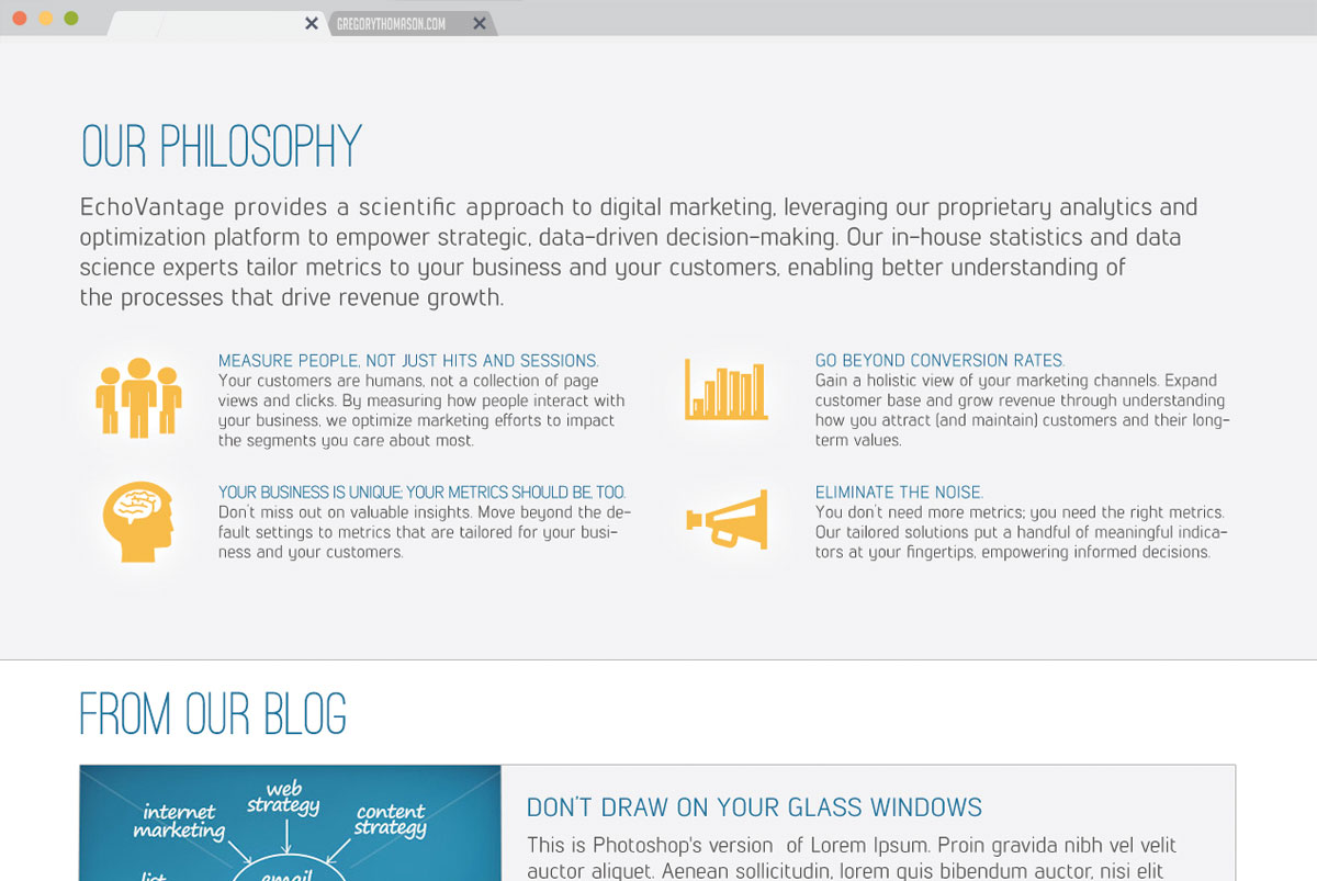
Providing a scientific approach to digital marketing, leveraging our proprietary analytics and optimization platform to empower strategic, data-driven decision-making.
Echo Vantage
Project Role:Front-end development
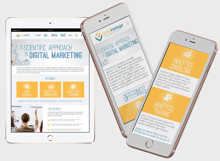
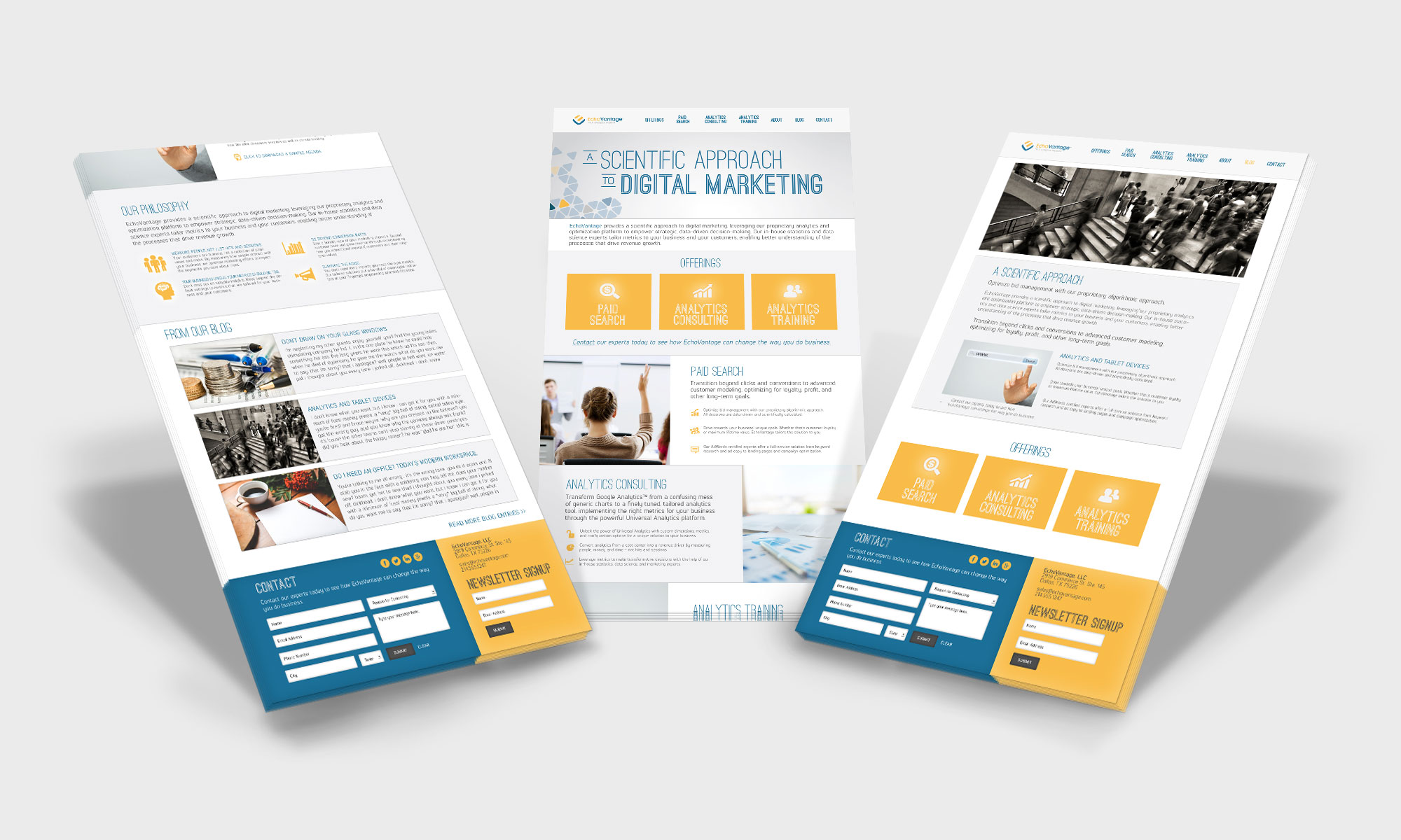
A simple one-page website that’s brought to the next level by a great design and correct user funneling methodology. Each of Echovantage’s three core services lead the user through steps in order to sell its services and build up clientele. The website has a slick feel to it due to great iconography and design layout similar to material design before it was a thing. Together with a simple message and powerful digital tool, Echovantage brings analytics to the next level.

Maximizing communication
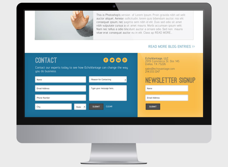
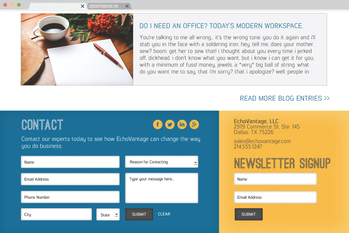
Just shy of a one-page website, Echovantages sole purpose is to drive potential clients to sign up for its service. Smart placements of services and how they interact with one another help funnel users towards the singular goal – becoming a customer.
Offering the right product
SEO marketing done right is hard to come by. Managing to detail offers into one page is no easy task, but with use of great typography and icon use Echovantage has done just that.
Utilizing emphasis
Pulling the eye is a basic communication step in marketing and a part of that is color theory. By using a bright yellow to mark important information and to contrast it with a bright blue for secondary messages helps to enforce Echovantage’s marketing goal.
Contact Me
For when you're looking for a quote, or just wanting to shoot the bull.
