Attack on Titan
Attack on Theatrical
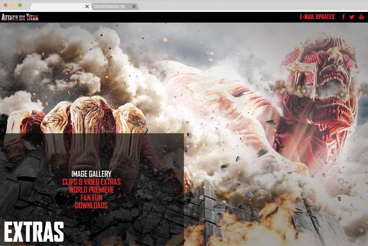
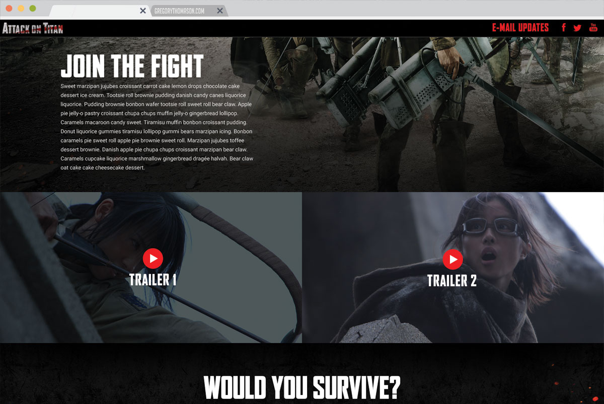
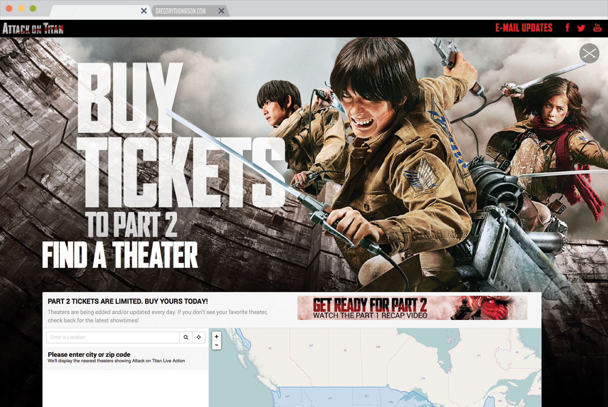
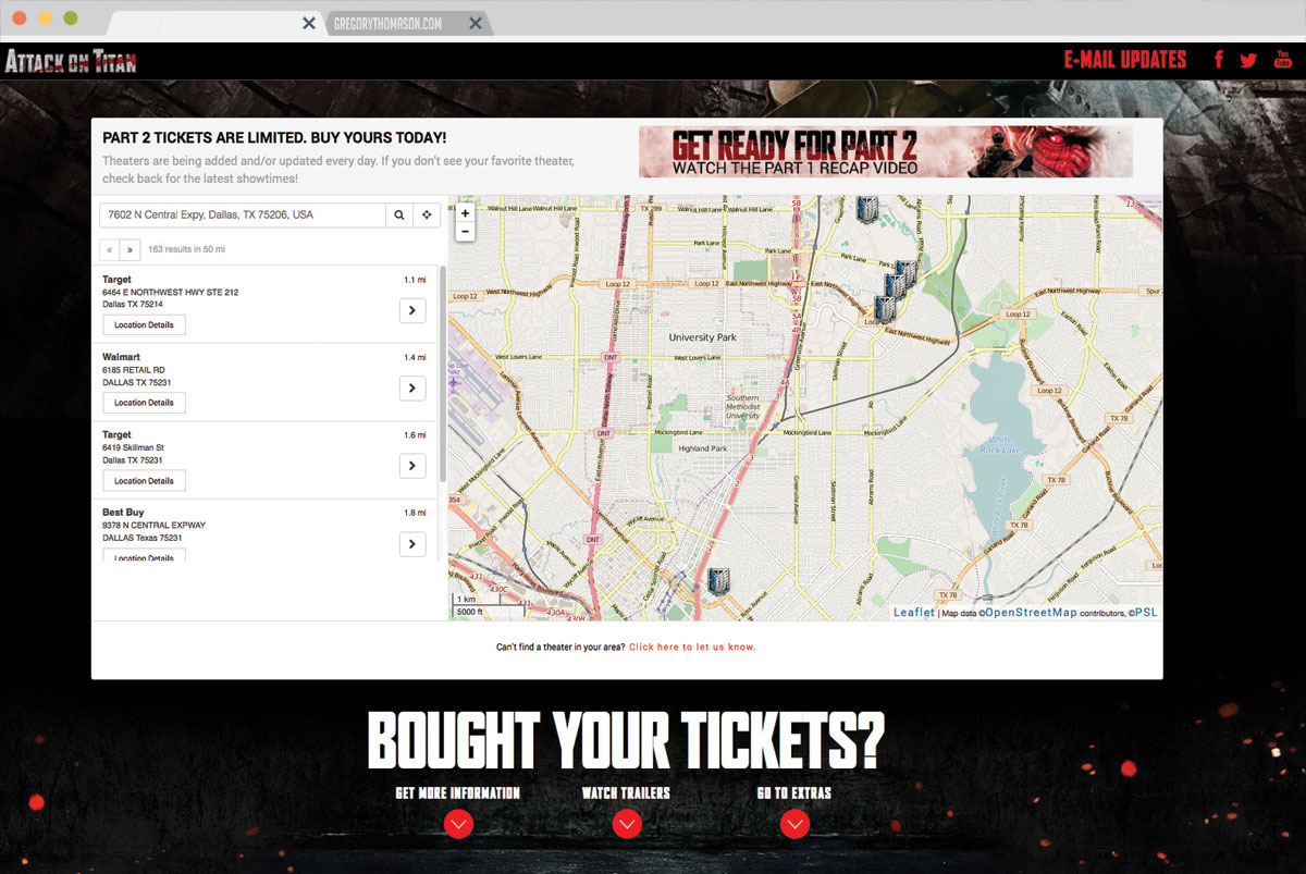
Building the theatrical website for the live action Attack on Titan franchise included some special components such as a theater locator, user-flow interface, and an atmosphere to drive hype for fans and collect emails.
Attack on Titan
Project Role:Front-end development
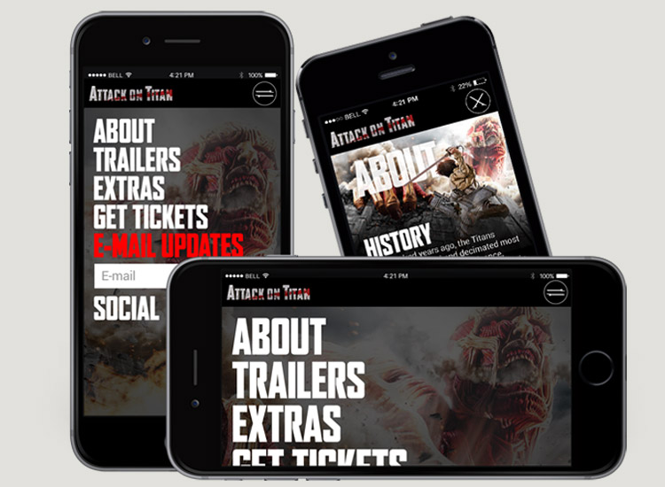
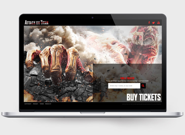
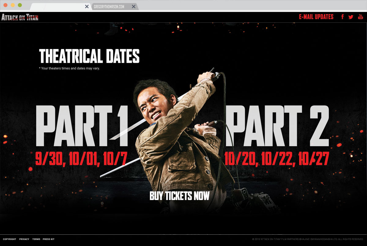
Probably the biggest thing in anime in nearly five years, AToT has blown up in its niche fandom. The purpose of this website was to sell tickets to the two movie showings for parts one & two. By using quadrants to weave the user through the sites navigation we were able to keep the flow simple and direct. Lowering the number of clicks was important so we included direct information inputs for items like email signups, and ticket locations. Not only did we have to reach an extremely niche fandom, but this fandom needed to be communicated with on where and how they could watch the new films.
Order tickets from anywhere
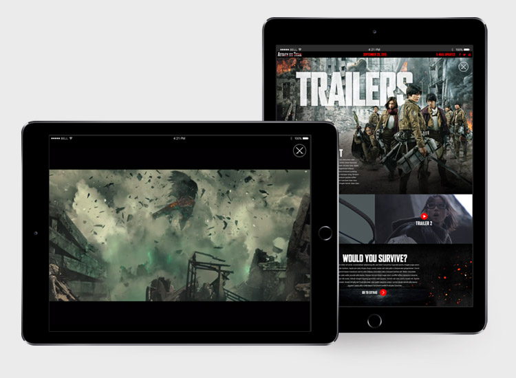
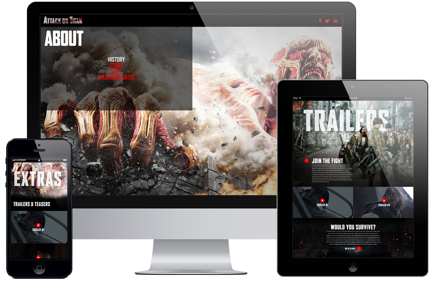
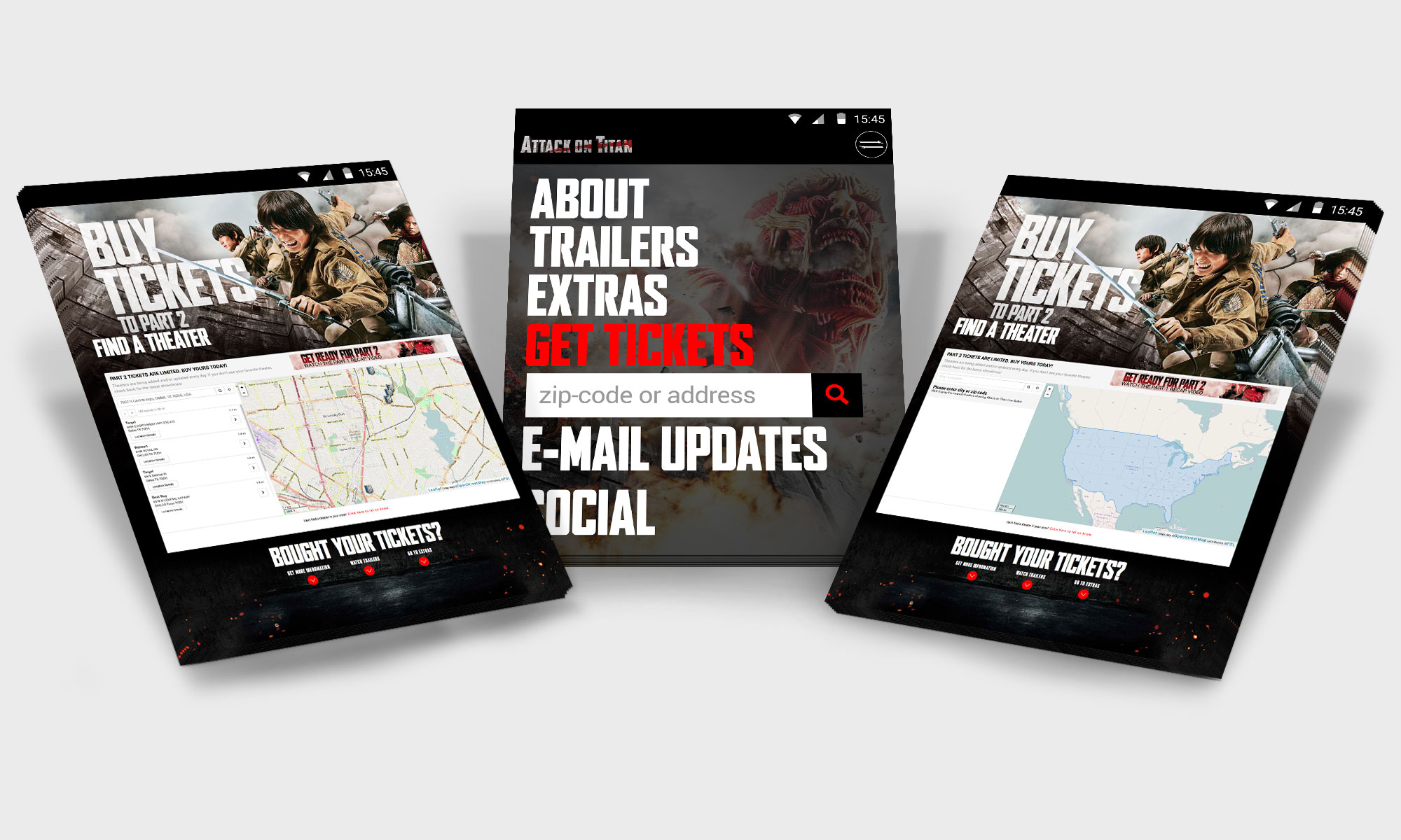
Core fans of Attack on Titan are always on the go. With nearly 50% of our audience constantly on mobile we knew we had to serve an experience no matter what device a user was on.
Fan interaction
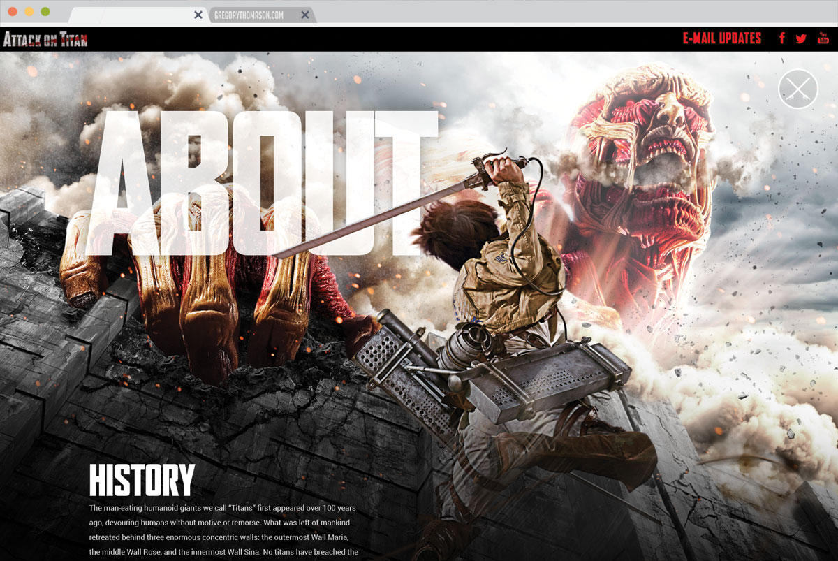
Getting people to go to the theater can be a challenge; but with Attack on Titan Live Action this was going to be solved by several interactions. Using elements from within the show, such as its sword weapon, helped give the site a unique feel. Being able to order tickets on every device was important to put people in theater seats. Intimate knowledge of the brand and its audience helped raise the bar for the site over a generic Hollywood styled website.
Mapping the map
Theatrical releases for a foreign film are generally pretty small. With Attack on Titan a large number of theaters were brought in to meet the wants & needs of fans. Enabling these fans to find theaters and order tickets in one place helped raise sales and the validity of having a theater locator on micro-sites.
Contact Me
For when you're looking for a quote, or just wanting to shoot the bull.
